
About Me
Hello, my Name is RynI am an AuDHD Artist and professional Graphic and Print Designer with several years of layout experience in fanzine projects and a special interest in color management and image file formats.My ADHD is my superpower in terms of having multiple interests and skills, I am always hyped to try out new things!Also being autistic helps me to dive deep into certain aspects of my work, finding connections in different skills, fields and individual solutions in record time!I hope you like my creations and feel inspired to get in touch!
Renyuryn - Rebranding

Renyuryn Banner
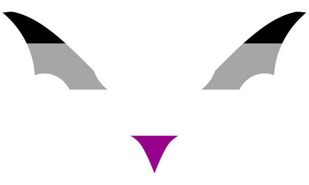
Accessible Icons
(Project of Annika Brinkmann)[ongoing]

Icon samples
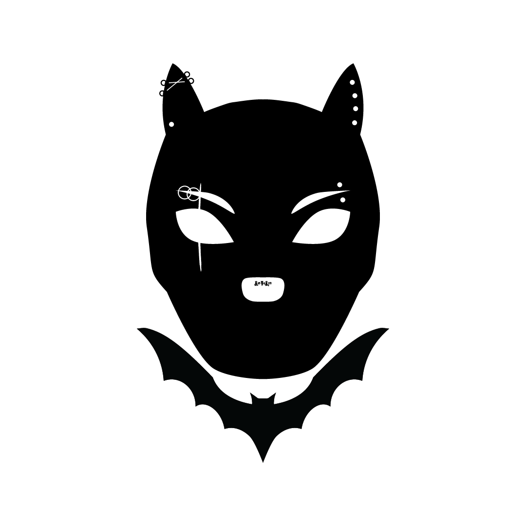
Pup Bat Commission

Pup Bat
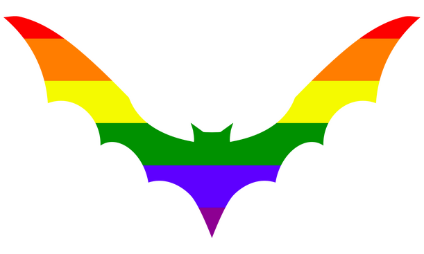
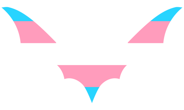
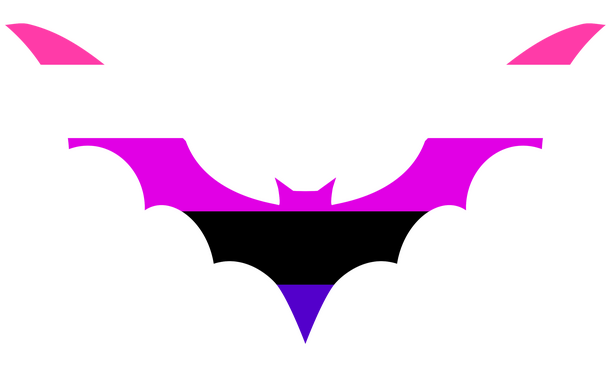
Rainbow Bat - Collar Bat

Rainbow Bat
My own rebranding
Due to cancelling Adobe, I've lost access to the fonts used in my old "logo" and banner shown below:

Old Banner

I admit this was not the best design, especially the font in my brand name is not optimal for several reasons, so I took the long journey to look at all the free fonts available.Important keypoints:
-readability
-variable fontsSo the journey began and I started with a lot of different fonts, looking for the style, combining different fonts in the Brand name first:

first font variations

As you can see, I've also played with altered characters.
At first, I wanted to mix medieval and modern characters to show my personal style as a goth but also designer aiming to go minimalistic.
But I just recently realized (after about a year since I started this project!!) another part of my Logo works alone for my goth identity.
The Bat
Some time ago, I created this collar bat for shirt designs and made variations with pride flags:

Rainbow Bat

I've somehow grown to bats in general as they are mainly active at night and closely linked to vampires (which are kinda my special interest).
I am also active later at day and in the night, perfect fit to use the bat as my personal icon.But how to combine it with my brand name?Luckily, since I have this uppercase Y in my name, the idea was to shape the bat like the character for a replacement.
But damn, the development took ages because a lot of fonts have the Y shaped differently.Furthermore, altering the bat into a Y too much would lean into a bat-shaped Y and it wouldn't work as a standalone icon anymore.
Well, this was tricky but I was able to shape it being suitable as an Icon and the Y in my brand name as well!Here's the process:

Bat development

I'm happy with the end result which is the green-boxed bat.Note that the process went simultaneously with choosing fonts for my brand identity.And for readability, I even tested the fonts on a dark background to see which ones are good to read:

font readability on dark background

I've also marked which ones are variable and such, but in the end they also had to fit the style including the bat for my brand.My process is like a try and error game where I just take the brand name and copy it to oblivion applying every font I like on first sight.After that I eliminate those I don't like in the comparison on second sight.
The next step is comparing fonts for typefaces and readability.And this goes back and forth, also with altering the bat fitting for those etc.When I get stuck at some point, I just take a break.
Pushing through is the worst you can do. Some processes need time.Well, in the end I stuck with those variations:

Logo Brand Name Variations

The final decision was surprisingly quick, I chose Museo Moderno for the brand name and using it for headlines while Outfit became the font for running text.
Side note: I was already using Outfit as font for my invoices because this one is really satisfying to read for me and I hope this also applies to everyone reading text on my website!But because the brand name with just the bat appeared to be a bit boring to me, I spontaneously added the circle in the back to "complete" the image.And these are the final results of my icon and banner:

Icon dark

Icon light

Banner dark

Banner light


Pup Bat Commission
Pup Bat black
Pup Bat White
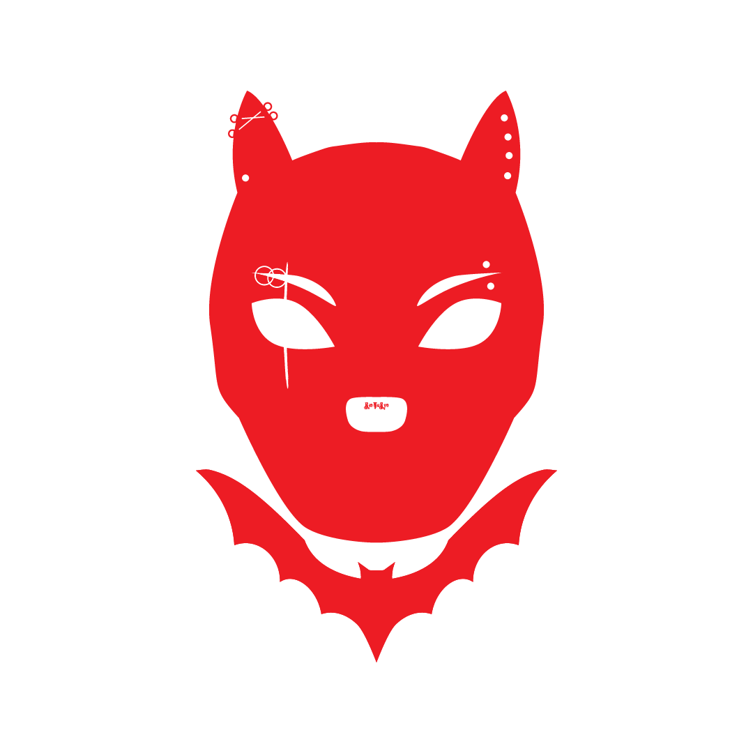
Pup Bat Red
Rainbow Bat
I had the sudden idea of creating a bat fitting to a shirt collar and another idea of creating a brand targeted to queer goths was running around in my head for a longer time so I combined both and Rainbow Bat was born!In my design process, I simply created a circle in Illustrator to shape the bat around which is also made of multiple circles.The following bats are the three main variants

Black Bat

Rainbow Bat

White Bat


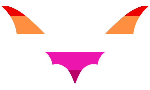
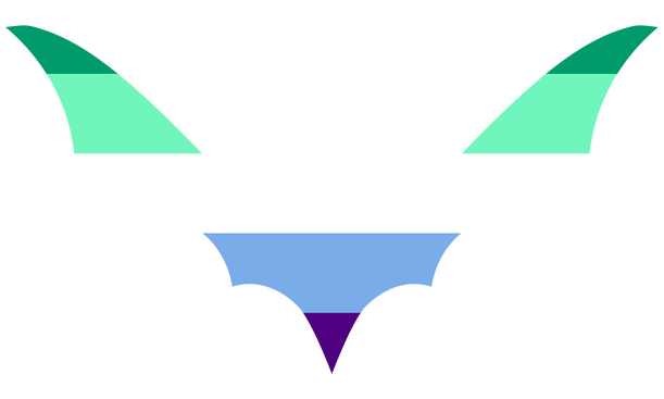
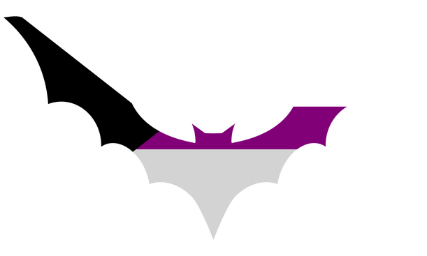
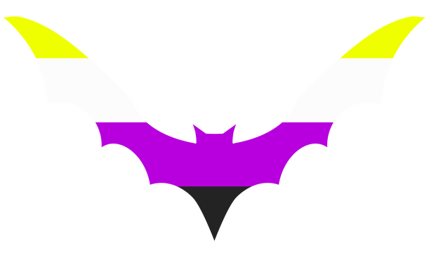
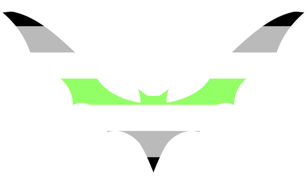
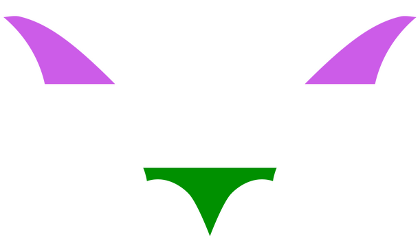
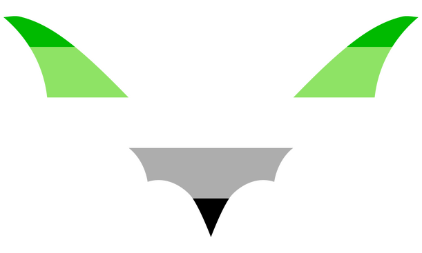
More variations: Pride Bats
Rainbow Pride Bat
Lesbian Pride Bat
Gay Pride Bat
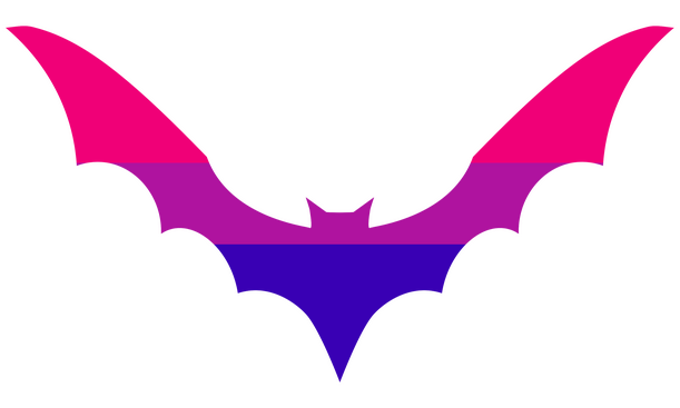
Bisexual Pride Bat
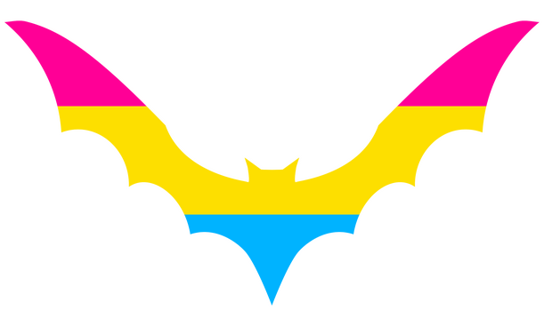
Pansexual Pride Bat
Demisexual Pride Bat
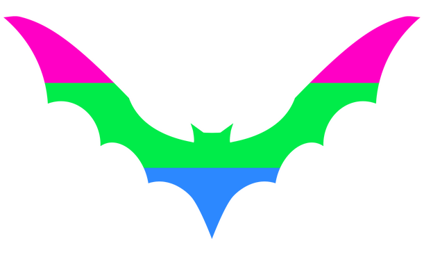
Polysexual Pride Bat
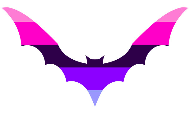
Omnisexual Pride Bat
Asexual Pride Bat
Transgender Pride Bat
Intersex Pride Bat
Nonbinary Pride Bat
Agender Pride Bat
Genderqueer Pride Bat
Genderfluid Pride Bat
Aromantic Pride Bat
Polyamory Pride Bat


Poison Apple Zine - Image by aaronmwill
The Seat of Sacrifice - A Themis Zine
I was lucky to be part of the Themis Zine!My role was being the formatting mod in a new team for me.
It was a very nice experience because this project was well organized!I also got asked if I want to contribute an artwork and happily created this version of Themis/Warrior of Light:

sketch

base shade

flat colour

shading

coloring done

smoothing

finish


Well...sadly some issues crossed my way and I had to leave the main zine formatting to the other mods.
So my only part was formatting the BTS (behind the scenes) Zine
Untamed 3
Role: LayoutMy latest formatting project and oh boi....what a ride.While I was also in the mod team of the Themis Zine which was well organised, this one went silent. Very silent.Things got messed up and actions had to be taken.And if that was not enough, I had to take a break for personal reasons.Fast forward to now, I took over the formatting again when coming back and currently doing the last steps for the main zine!I also did an artwork for the bestiary section:

Baby Bat

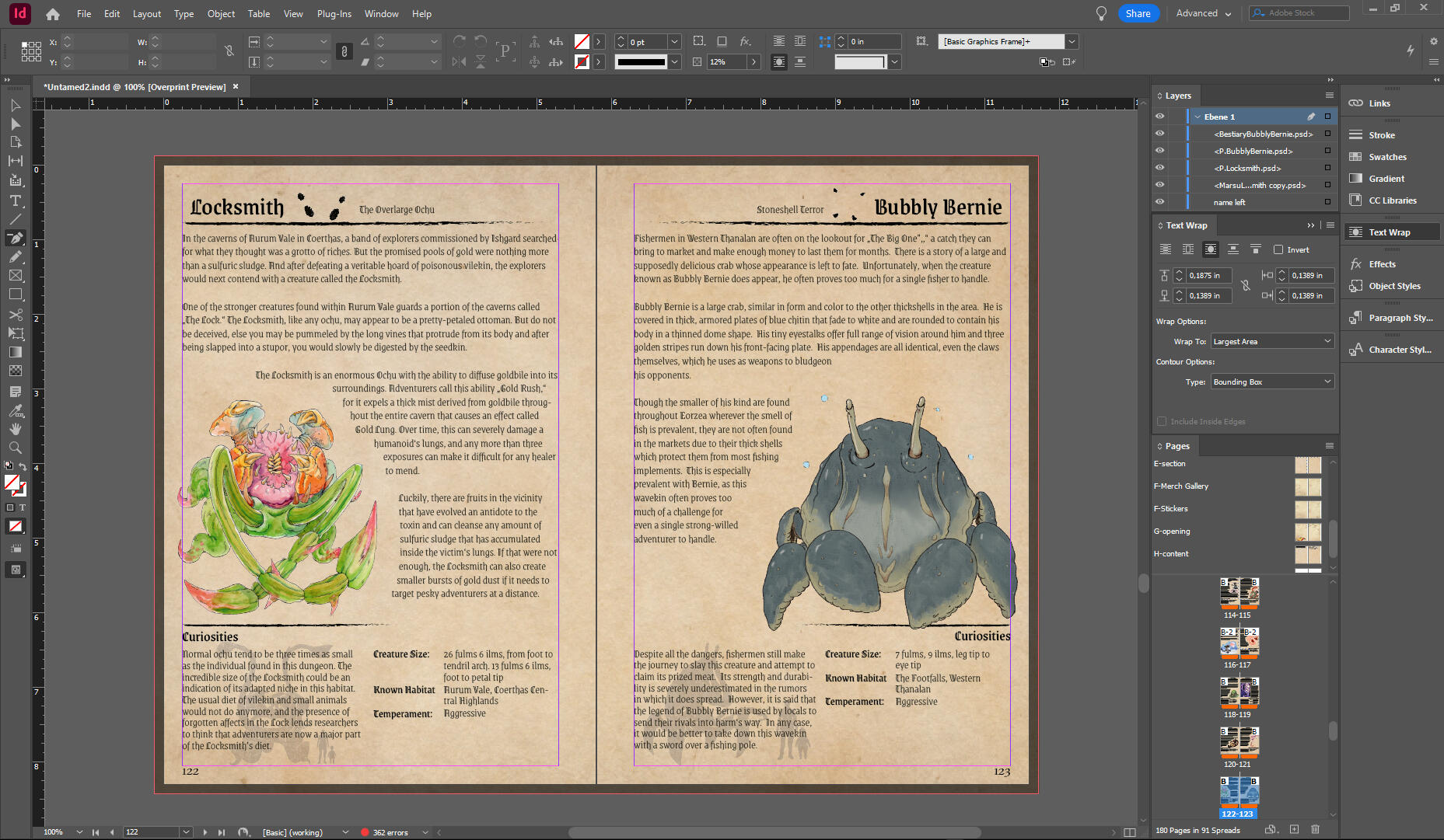
Untamed 2
Role: LayoutMy third layout project, I have learned a lot new skills in between to improve the workflow in layouting and text formatting

Voidsent Edit

Bestiary in Edit
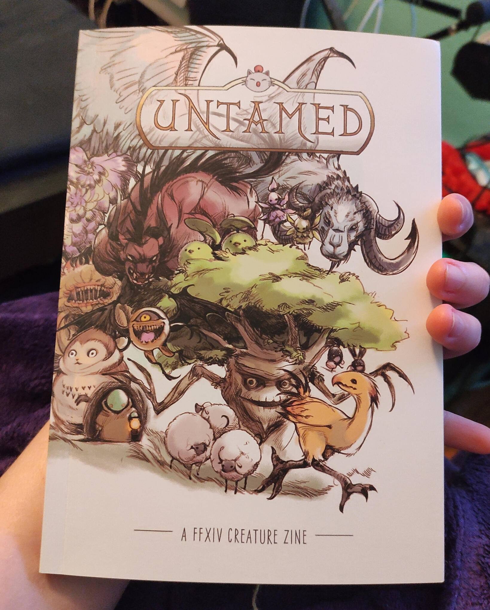
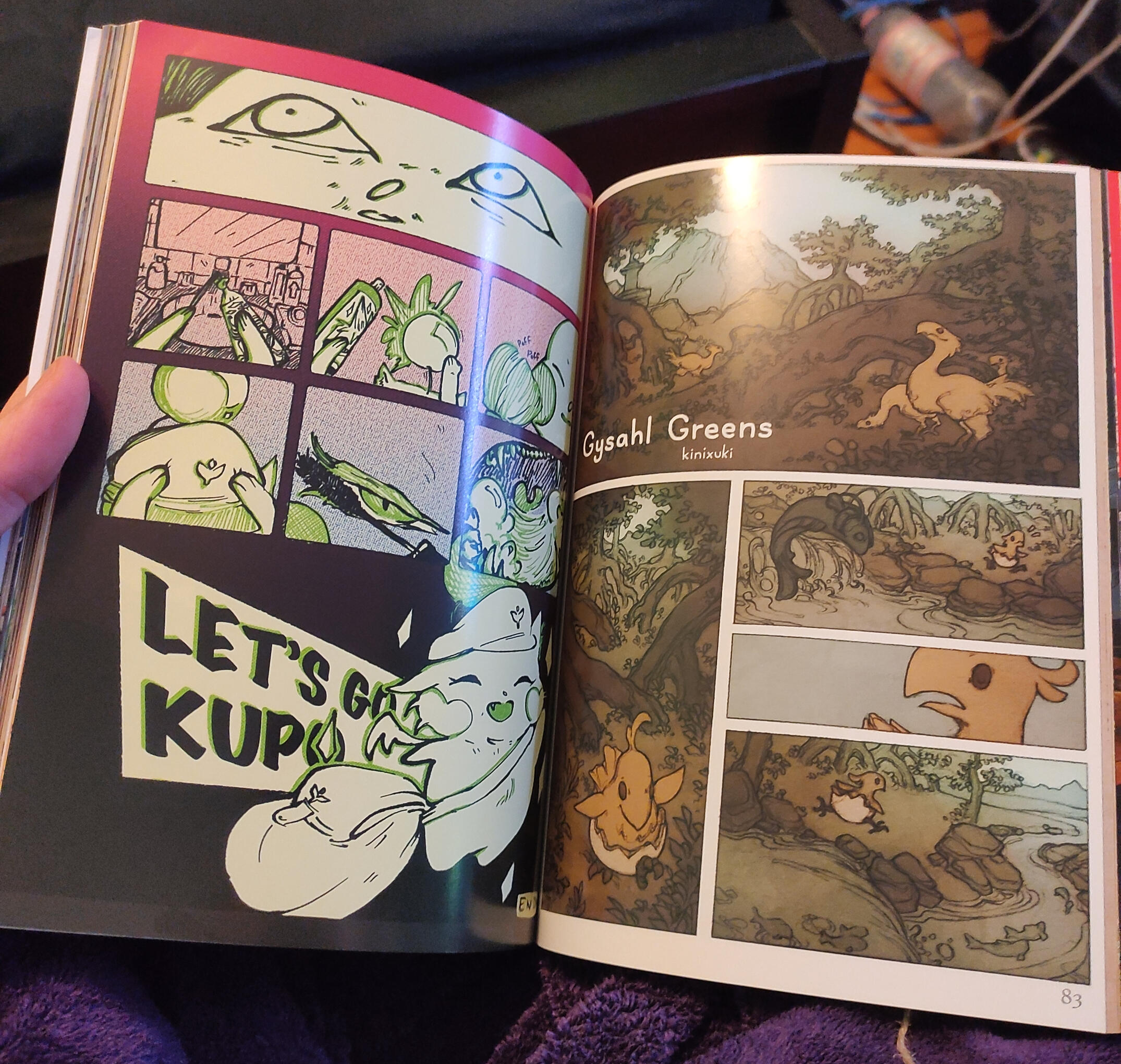
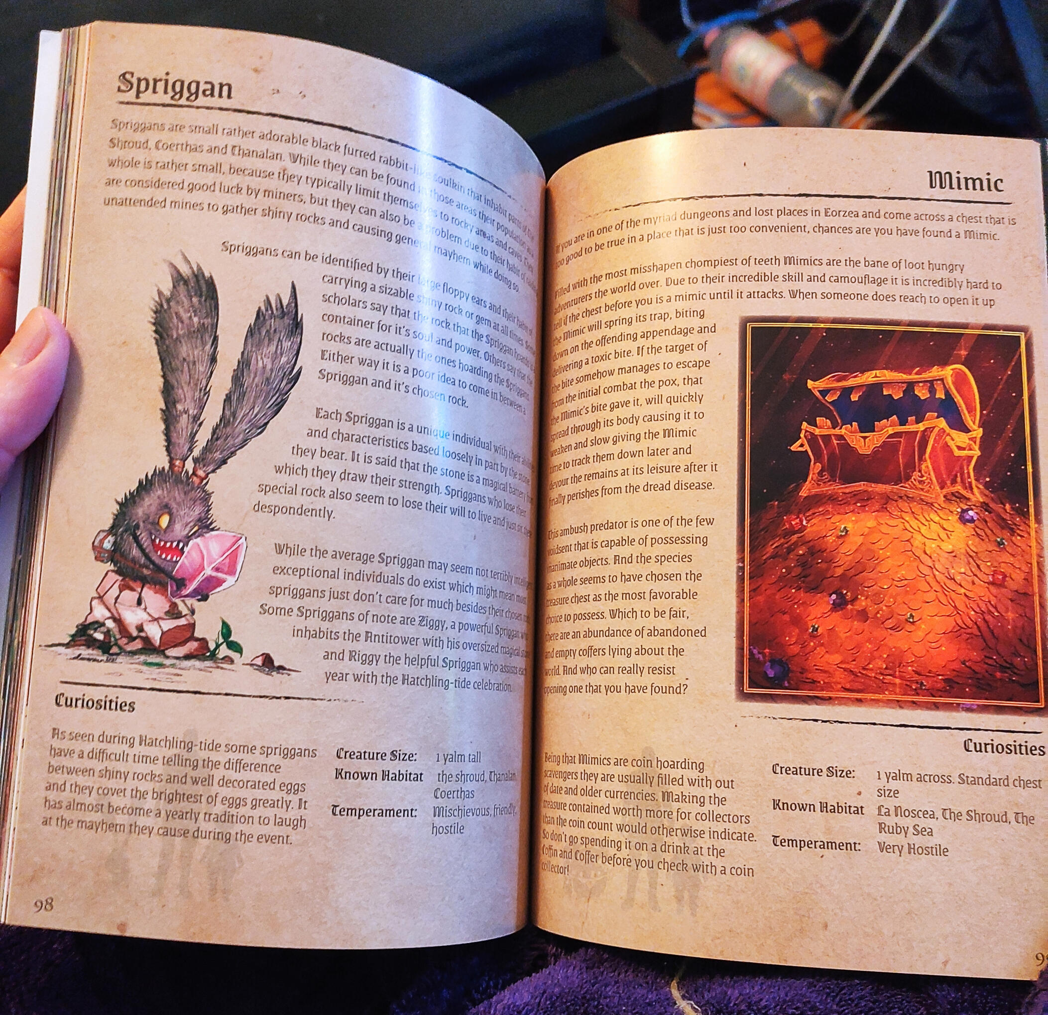
FF14 Untamed Zine
Role: Layoutthis was my first layout project ever and I am happy I was able to put my skills on test for this and I love the result!

Printed Zine

Comics

Bestiary

Illustrations
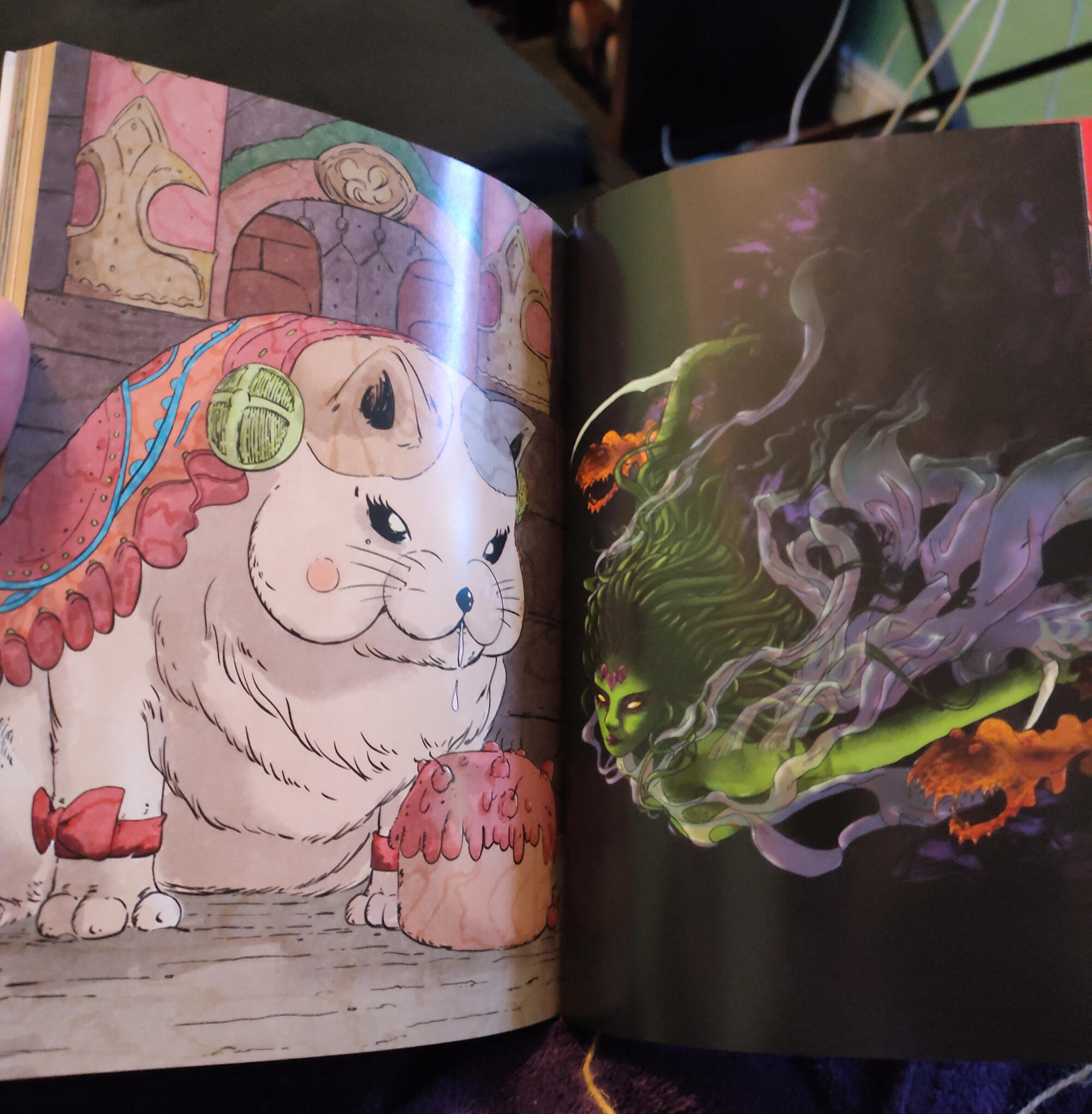
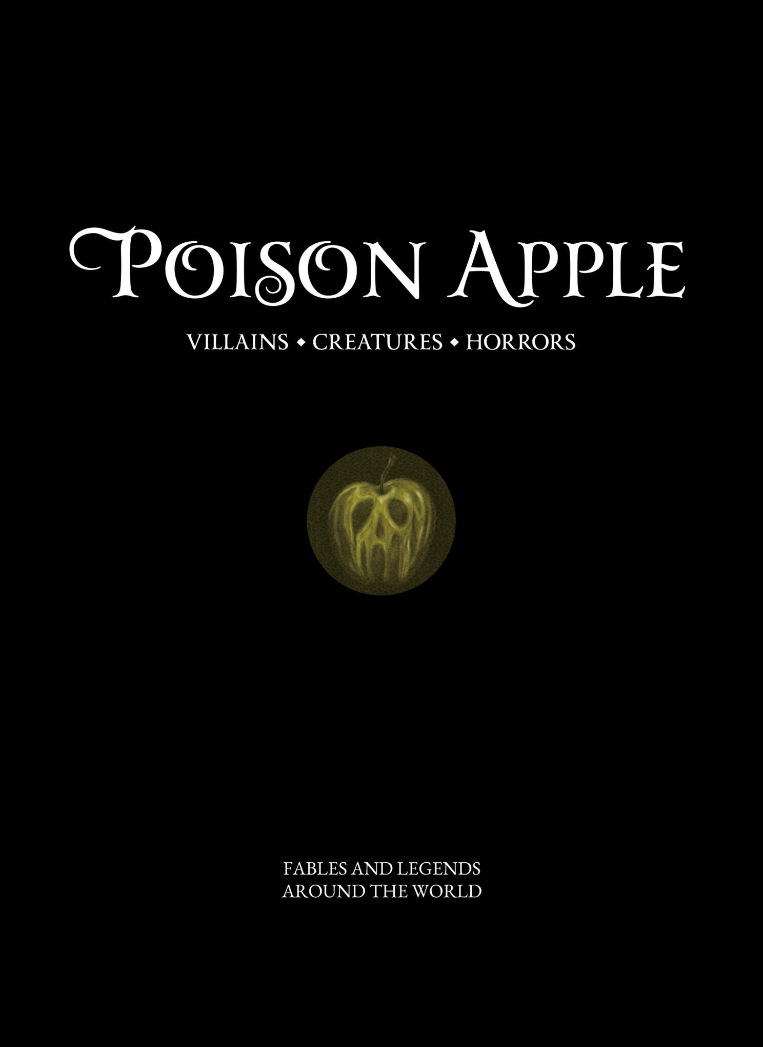
Poison Apple Zine
Role: LayoutMy second layout project!
I loved to arrange all the texts and images, the printed book is a real masterpiece!

Poison Apple Insight
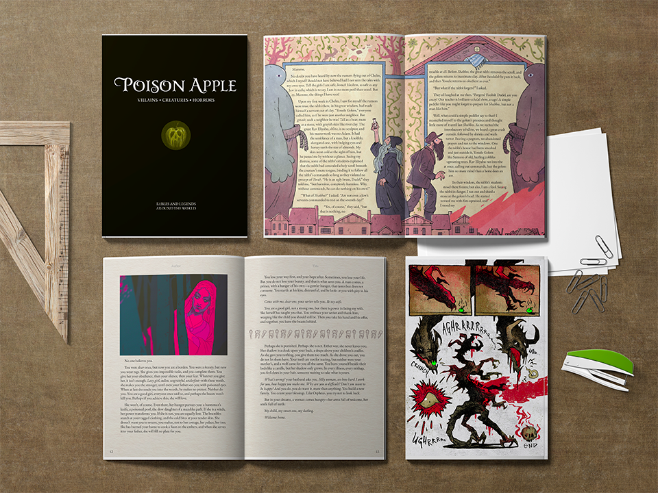
Illustration Portfolio

Digital Illustration

Digital Illustration
Moon Cat

Art Portfolio

Abstract Art


Fanart

Abstract Art
Bleeding Heart/Flower

Bleeding Soul


Fanart

Baby Bat - Contribution for Untamed 3

Elidibus/Warrior of Light - Contribution for The Seat of Sacrifice - A Themis Zine
Meteion Watercolor

Y'shtola Ink Drawing - Contribution for Memories of Crystal


Crafts
Wood Carving

FFXIV Warrior Symbol Carving

Contact
Impressum
R. Heising
Mindener Str. 23
10589 Berlin